
Network Map and PTV Rewards Program

Type:
App (Mobile - iOS)
Year:
2023
Role:
Managing the research & design process
UX Research, UI Design, Prototyping
Tools:
Figma & Plugins, Figjam, Notion
Adobe Suite (Photoshop and Illustrator)
Public Transport Victoria is the department that oversees the public
transport system (trains, buses, and trams) of Melbourne. Over 3 million people get around Melbourne and depend on the services of Public Transport Victoria to ensure safe and reliable travel.
PTV recognizes that if it increases the ridership on public transport (specifically during off-peak times), everyone wins — residents, visitors, businesses, and the city itself. With a better overall system, it will receive a bigger budget to make even further improvements, perform more frequent maintenance, and keep its workers happy. However, ridership isn’t close to what it could be. While the problem is large and multi-faceted, PTV believes that improving its digital offering via digital apps could lead to quick-win improvements.


Research
During the research stage of our project, we conducted a Usability Review of the existing PTV app, followed by a comprehensive competitive analysis focusing on public transport apps from five major cities: Singapore, Berlin, Paris, London, and Chicago. By identifying their strengths and weaknesses, we recognized the success of all-inclusive apps providing real-time updates and features such as next scheduled train information and crowd density. Through a Feature Inventory, we examined competitor app features, and user interviews were conducted to gain valuable insights. The research culminated in an affinity map, enabling us to understand user needs and preferences for a more user-centered design approach.
Usability Review


Competitive Analysis
Our competitive analysis revealed that users prefer all-inclusive apps offering multiple options. The Network Map feature was successful in displaying city-wide connectivity. Real-time updates and notifications helped users prepare for disruptions, while the ability to view crowd density enhanced the public transport experience. These findings guided our app's development to align with user preferences.


Initial Findings
All inclusive apps are preferred by users - they provide multiple options.
Network Maps - displaying connectivity throughout the city
Contactless pay is a convenience and highly appreciated by users.
Real-time updates and notifications are helping users to be prepared for possible disruptions.
Ability to view crowd density
User Interviews
Affinity Mapping

Findings
User 04
Prefers to travel during peak hours
User 03
Prefers to travel during peak hours
User 02
Prefers to travel during off-peak hours
User 01
Prefers to travel during off-peak hours
“This is an experience and it disrupts your daily routine by minimising youroptions."
“I feel sometimes it is hard to figure out when trains are coming."
“I should able to see how busy the train is - that would be a nice feature."
User feedback discrepancy about app functions - informs us about the usability of the app
Google maps was the preferred choice of users for planning their journeys.
Users prefer to be informed about any delays or disruptions prior to traveling.
Service disruptions and delays often result in user frustration.
During off-peak travel, users prefer to have a peaceful and comfortable environment.
Define & Ideate
We established a clear direction for our project by creating a persona and defining problem statements and "how might we" statements from user and business perspectives. Through design studio sessions, we generated creative ideas and revisited our research findings to make informed decisions. We narrowed down our ideas to an interactive map and a rewards program, conducting a comparative analysis of competitors' approaches to rewards programs. To solidify our design direction, we created user flows, outlining the step-by-step interactions and journeys within the app, providing a foundation for further development and refinement.
Persona

User Perspective
Problem Statement
Mark needs to view reliable live updates on the PTV app so that he can better navigate travel around possible delays and prevent unforeseen waiting time.
How might we...
improve the usability of PTV app so that users can quickly and easily view live updates regarding disruptions and schedules of bus replacements?
Business Perspective
Problem Statement
PTV needs a way to increase ridership (especially during off-peak hours) so that they can increase revenue and make further improvements on PTV's service.
How might we...
provide better incentives to encourage travel during off-peak times?

Design Studio / Sketching Session


Comparative Analysis


User Flow - Rewards Program

User Flow - Interactive Map

Design & Prototype
Our primary focus was to evaluate the success of our interactive network map proposal in comparison to other journey features. To achieve this, we utilized the existing functions of the app and integrated them into our prototype. By analyzing the visual style already present in the app, we ensured consistency by applying the same design elements to our proposed screens.
Wireframes


UI Design - Network Map


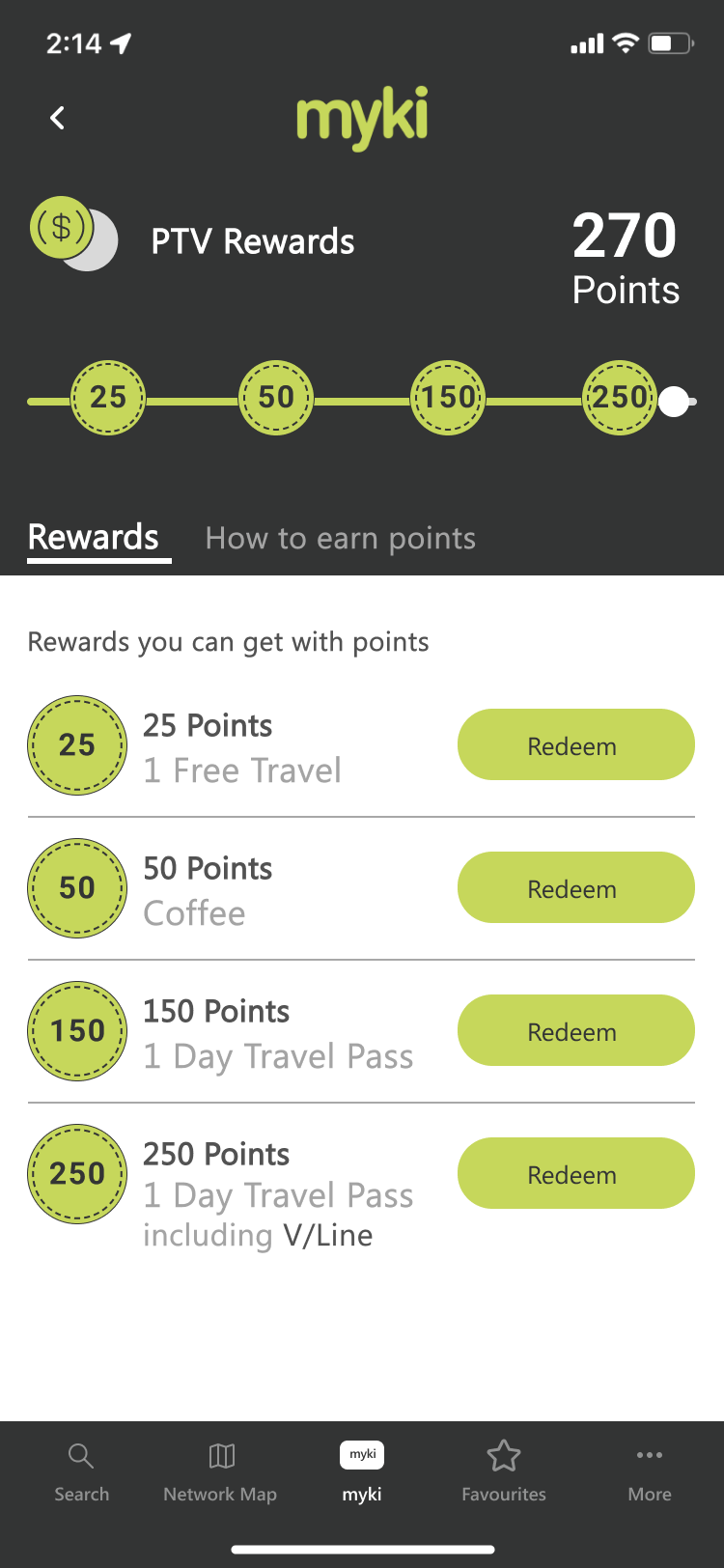
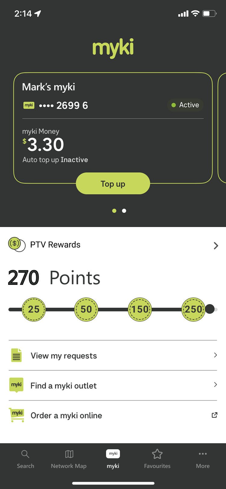
UI Design - Rewards


Interactive Prototype


Click to Play Video
Onboarding
Click to Play Video
Rewards Program
Click to Play Video
Click to Play Video


Redeeming Rewards
Click to Play Video
Train Network - Line Network
Click to Play Video


Click to Play Video
Network Map
Station Card - Bus Replacement
Click to Play Video
Test & Iterate
We conducted 8 usability tests, all of which were completed successfully. Users particularly appreciated the functions for reporting issues and viewing crowd density. Our proposed features, the Rewards program and network map, received positive responses. However, there were areas identified for improvement. Based on user feedback, we categorized the iterations into major and minor changes, which included updates to the Navigation menu, redesigning the Train/station card, and making adjustments to the network map. These refinements aimed to address user suggestions and enhance the overall user experience of the app.
What can be improved?


Outcomes
Throughout the project, we had a positive experience with our process. The real-time collaboration in Figma, allowing us to work together and stay in sync while designing, was particularly enjoyable. However, we also recognized that group projects can present challenges. We learned that to achieve the best outcome and enhance team performance, it is crucial to define tasks in detail and maintain clear and consistent communication throughout the design process. Reflecting on our experience, I aim to apply these lessons learned to future projects, ensuring smoother collaboration and even better results